Small moments,
larger systems.
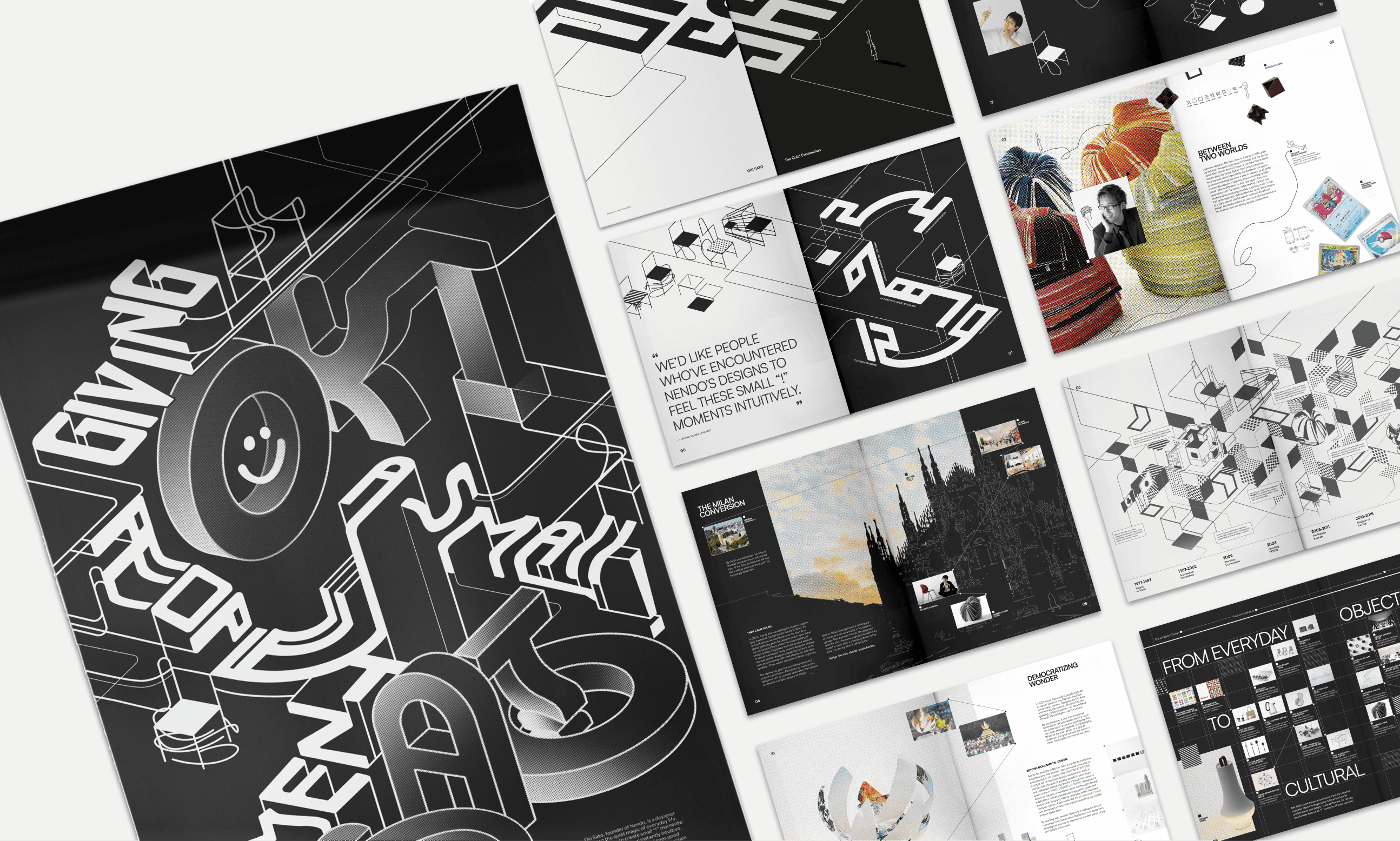
A semester-long study of Oki Sato, founder of NENDO:
his playfulness, his modularity and his eye for everyday moments,
translated into a poster, a booklet and a motion piece
that grow small, simple forms into larger systems.
Read the full process: Poster ↗
Read the full process: Booklet ↗
sole designer
Photoshop, After Effects
Poster
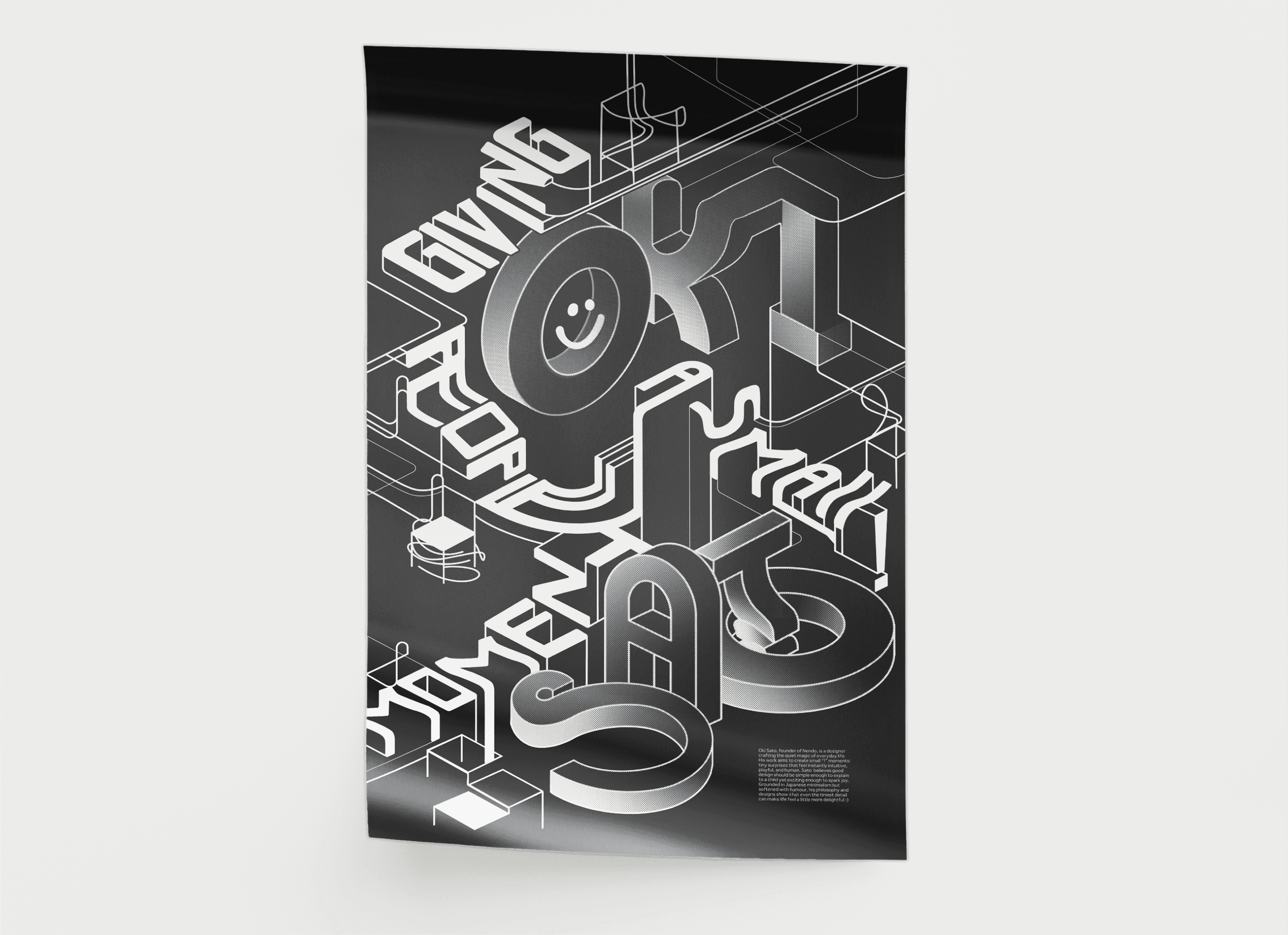
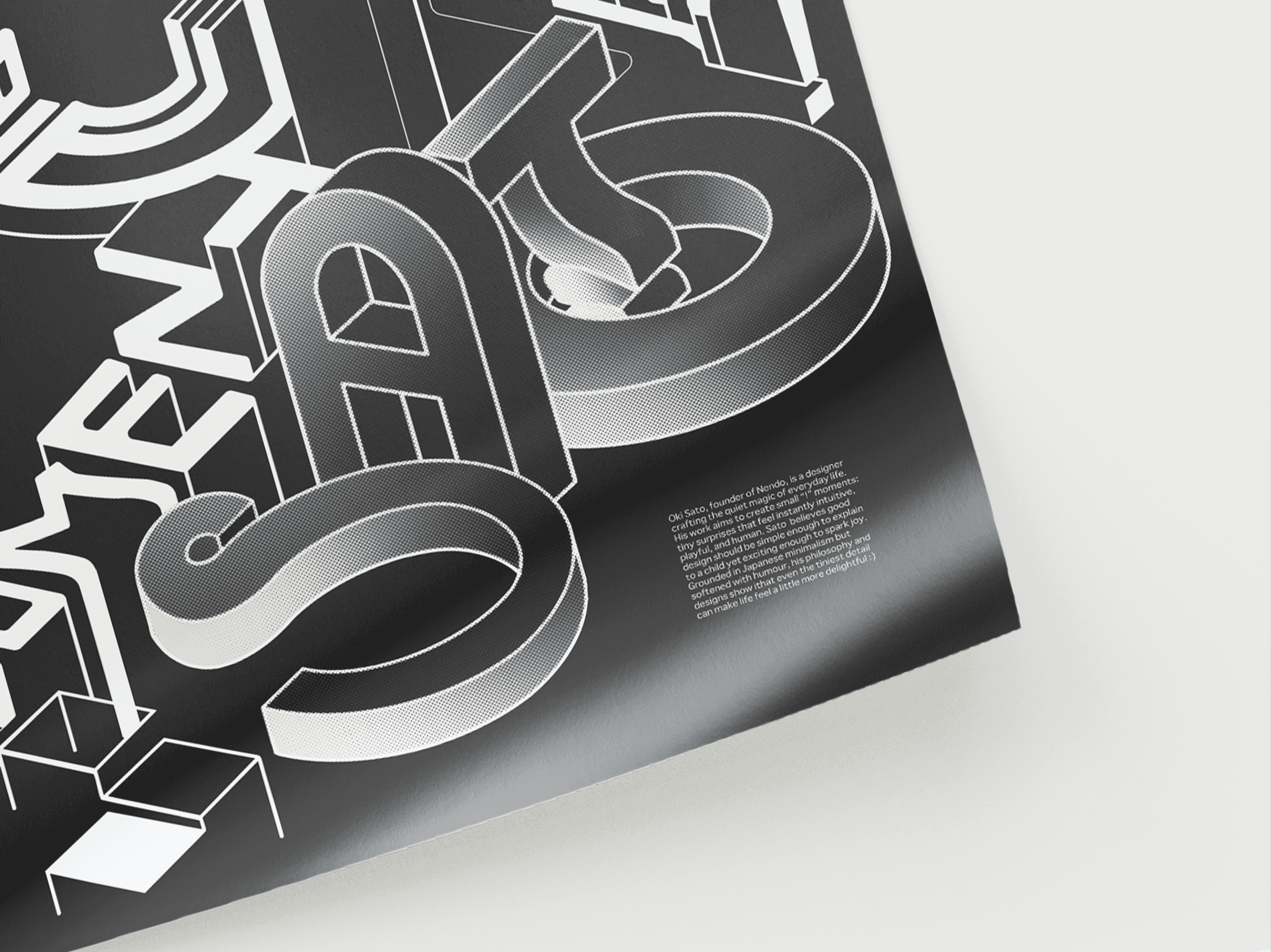
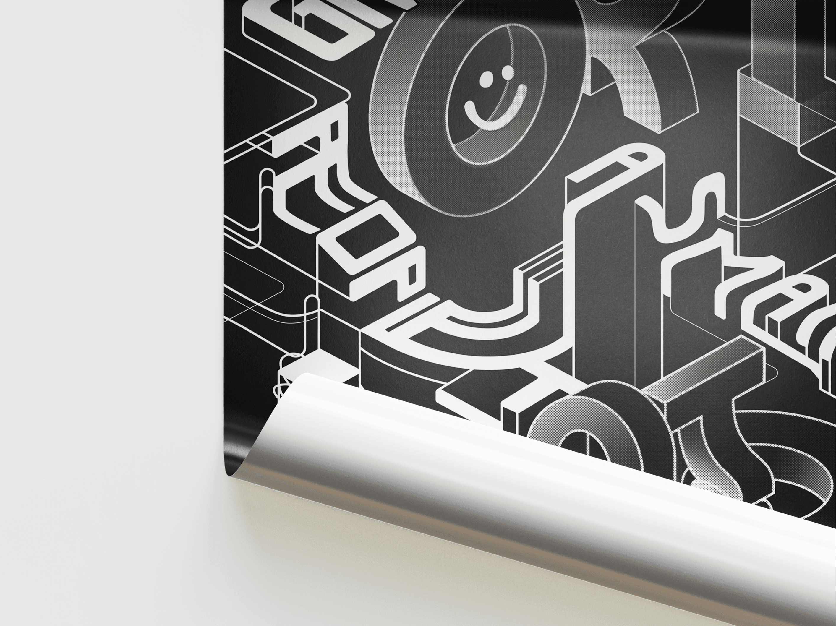
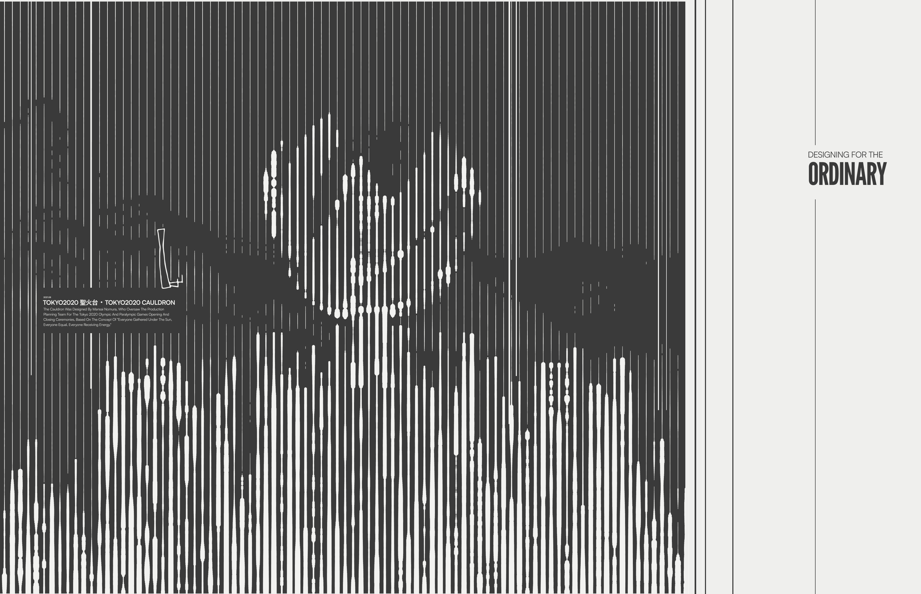
Type built like one of NENDO’s objects: simple strokes extruded into space, small marks adding up to one large form.
Booklet
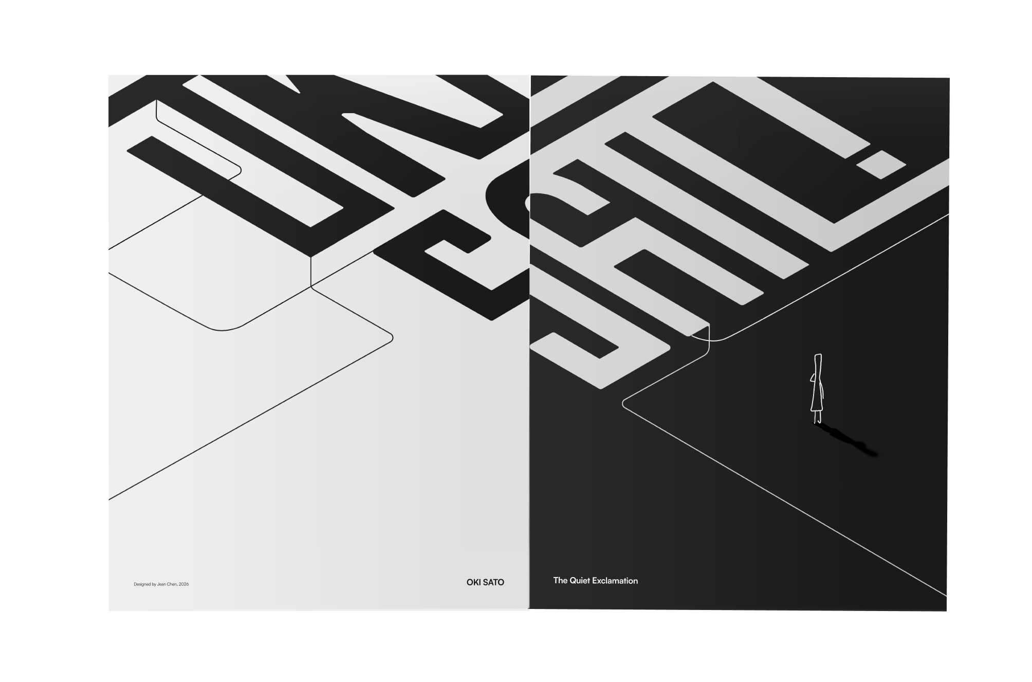
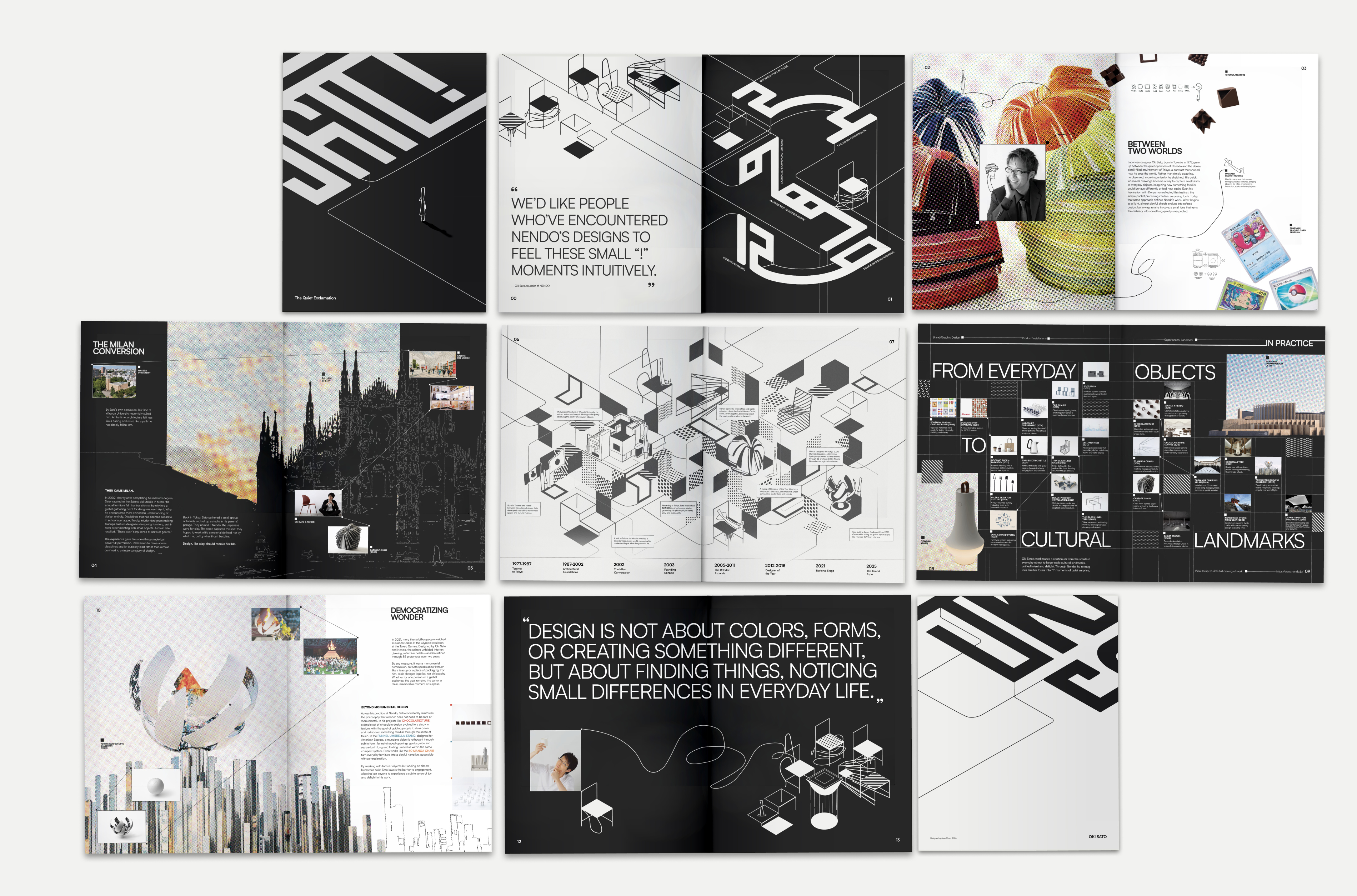
A fifteen-page booklet on Oki Sato’s life and practice.
System
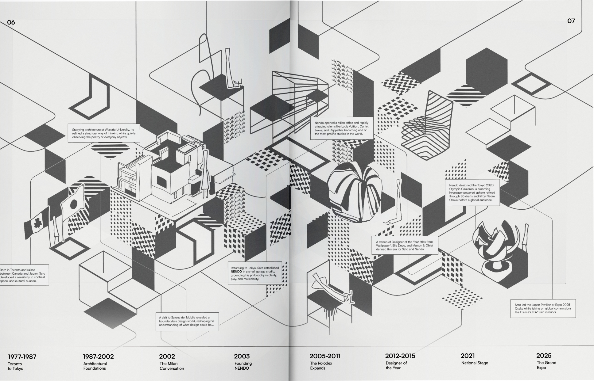
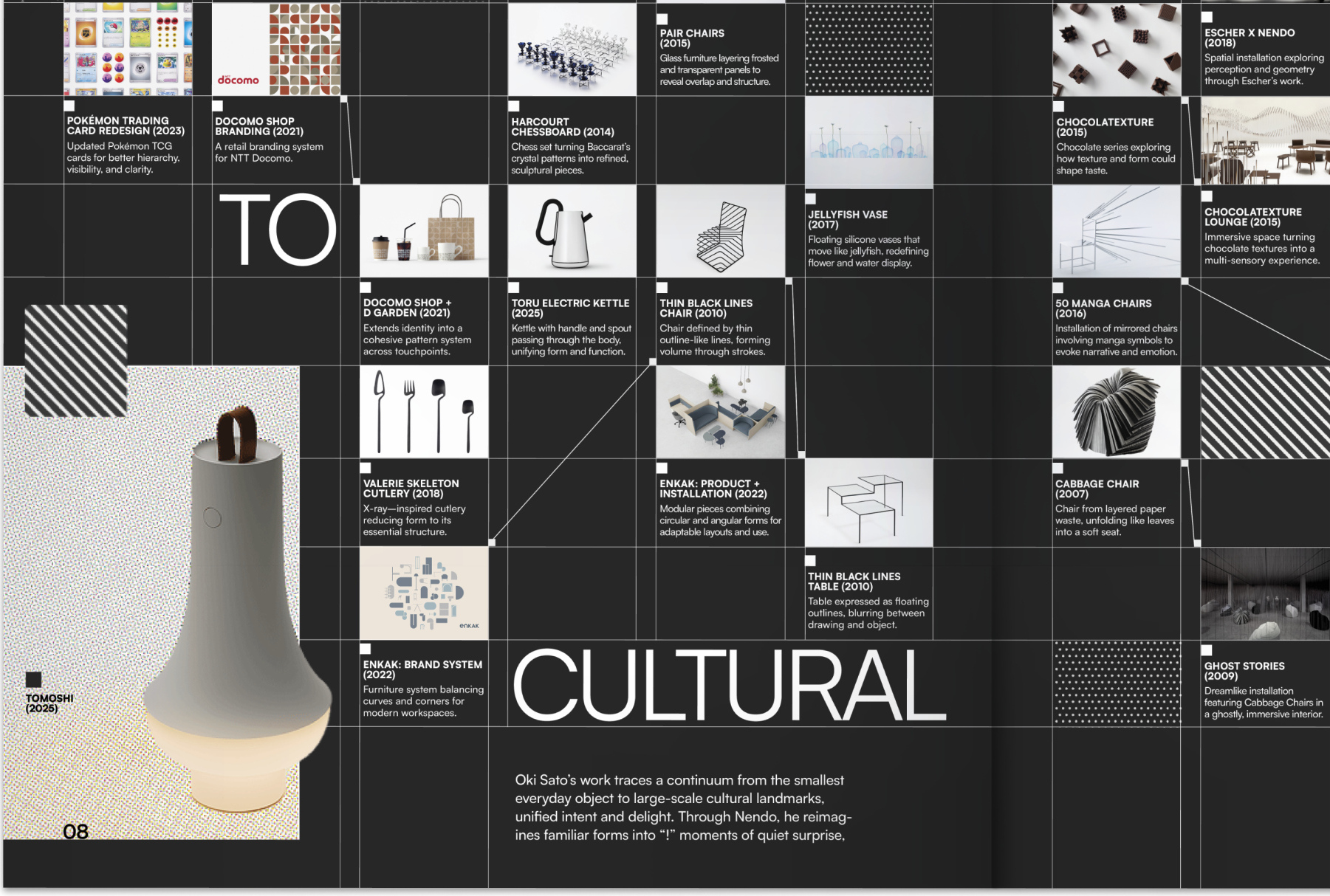
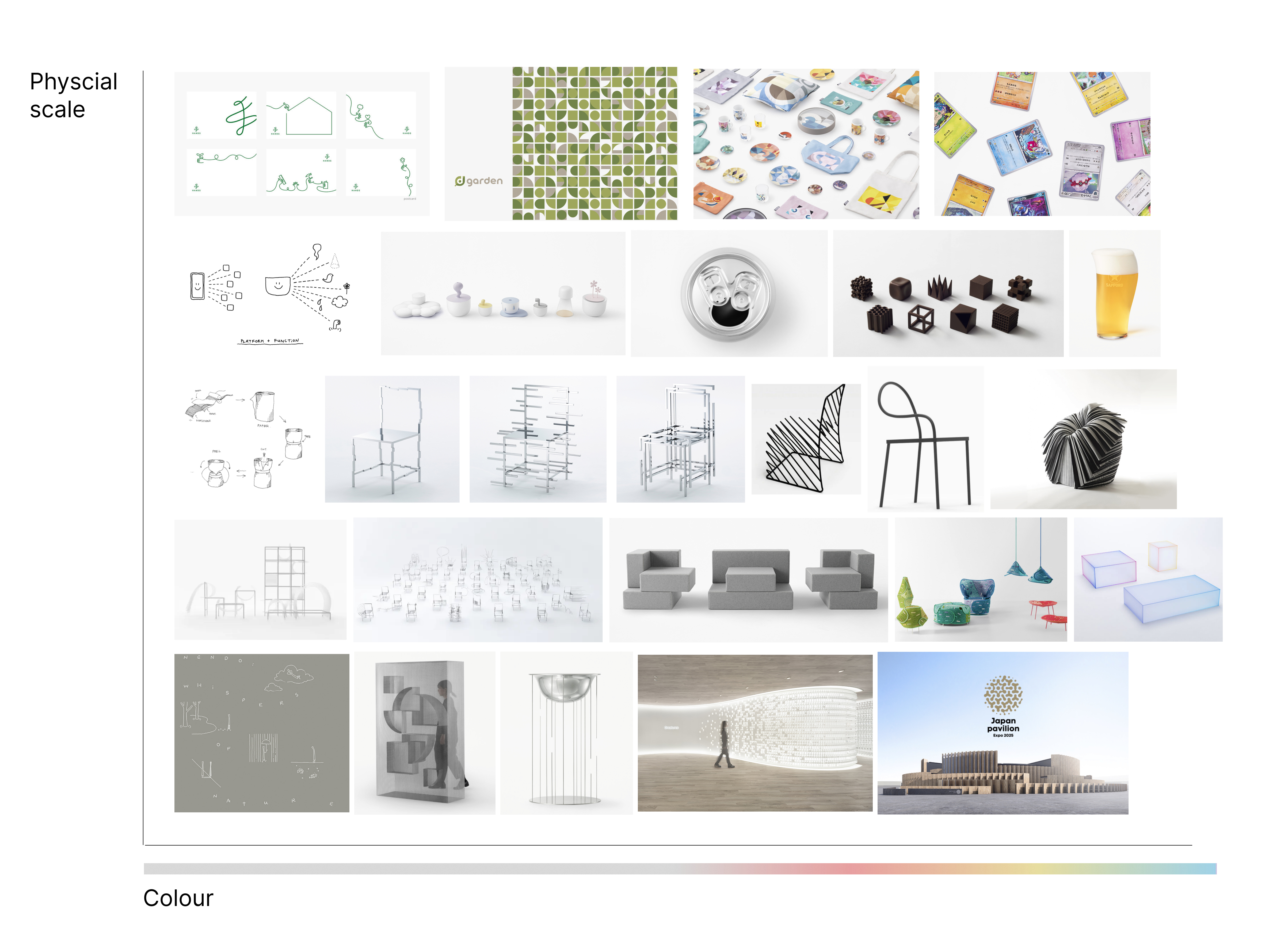
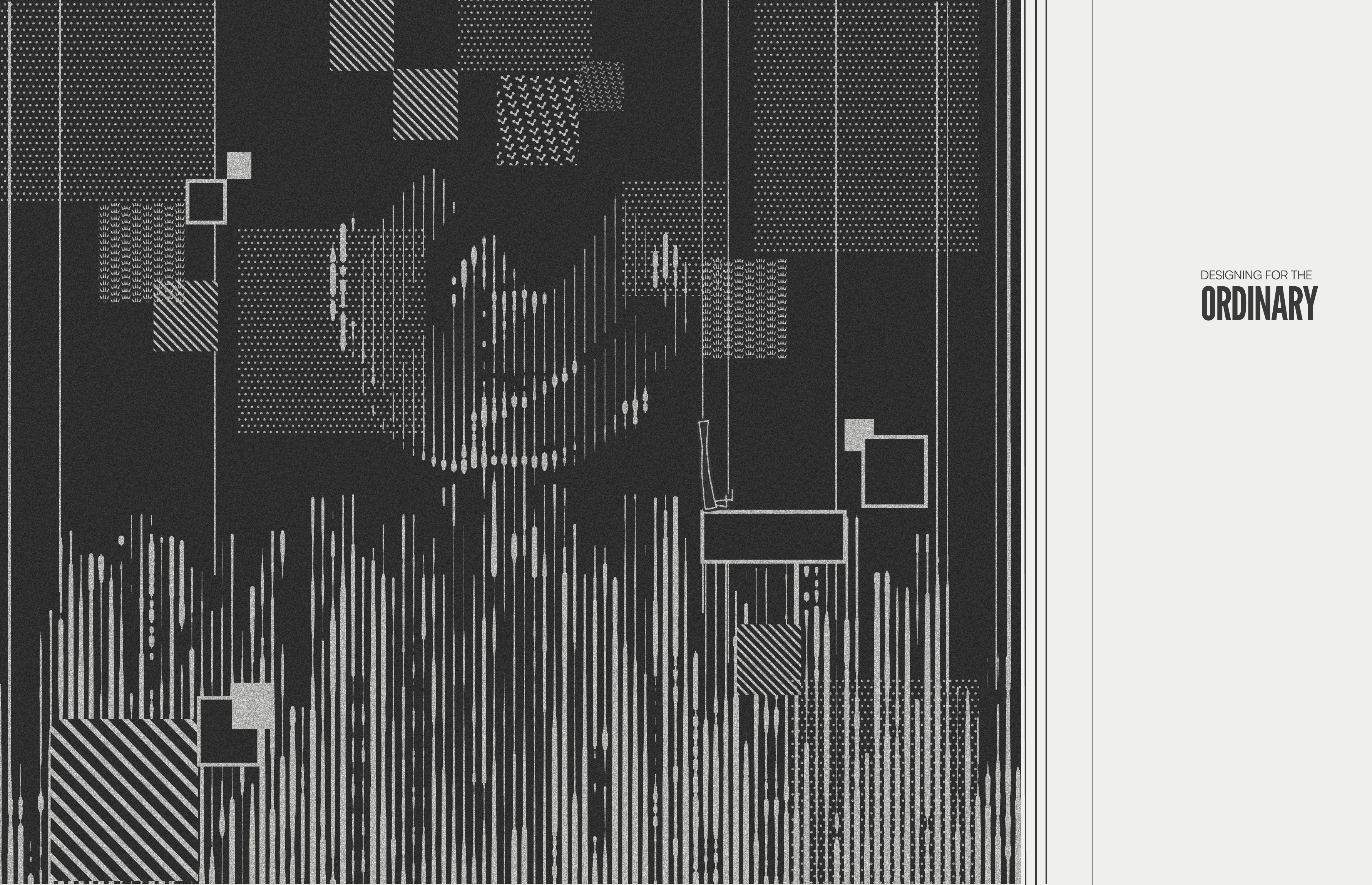
Everything is set in greyscale: one typeface, Satoshi, with isometric line drawings and seven patterns. The only colour on any page comes from his own work, so his objects are what bring colour to the system.
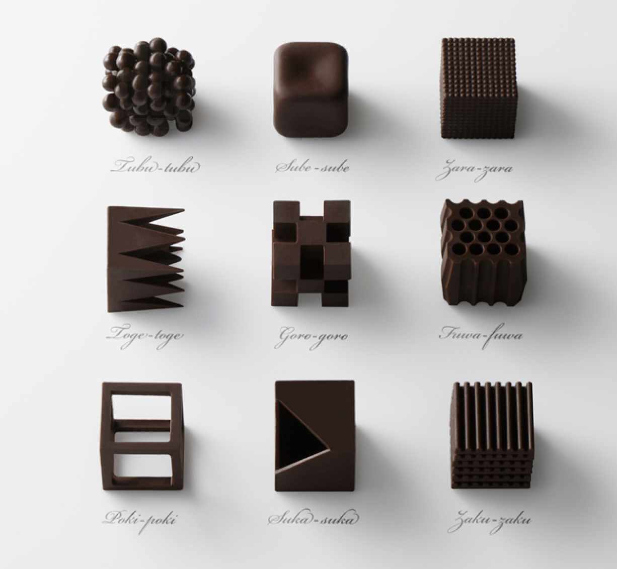
Every pattern starts as one of Nendo’s Chocolatexture shapes (2015). Each repeats until it fills a square, and the squares turn isometric to become surfaces in the booklet.
Hand-drawn vector isometric chairs, inspired by his 50 Manga Chairs series, carried across the poster, booklet and motion as part of the system.
Motion
Clips from the motion piece, animated in After Effects.
The full motion piece.
Process
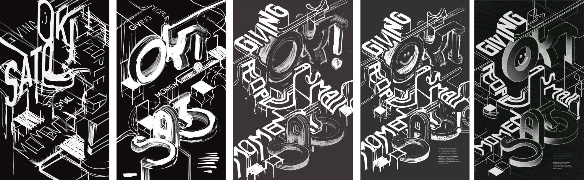
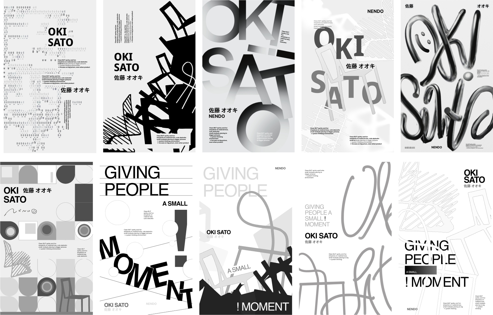
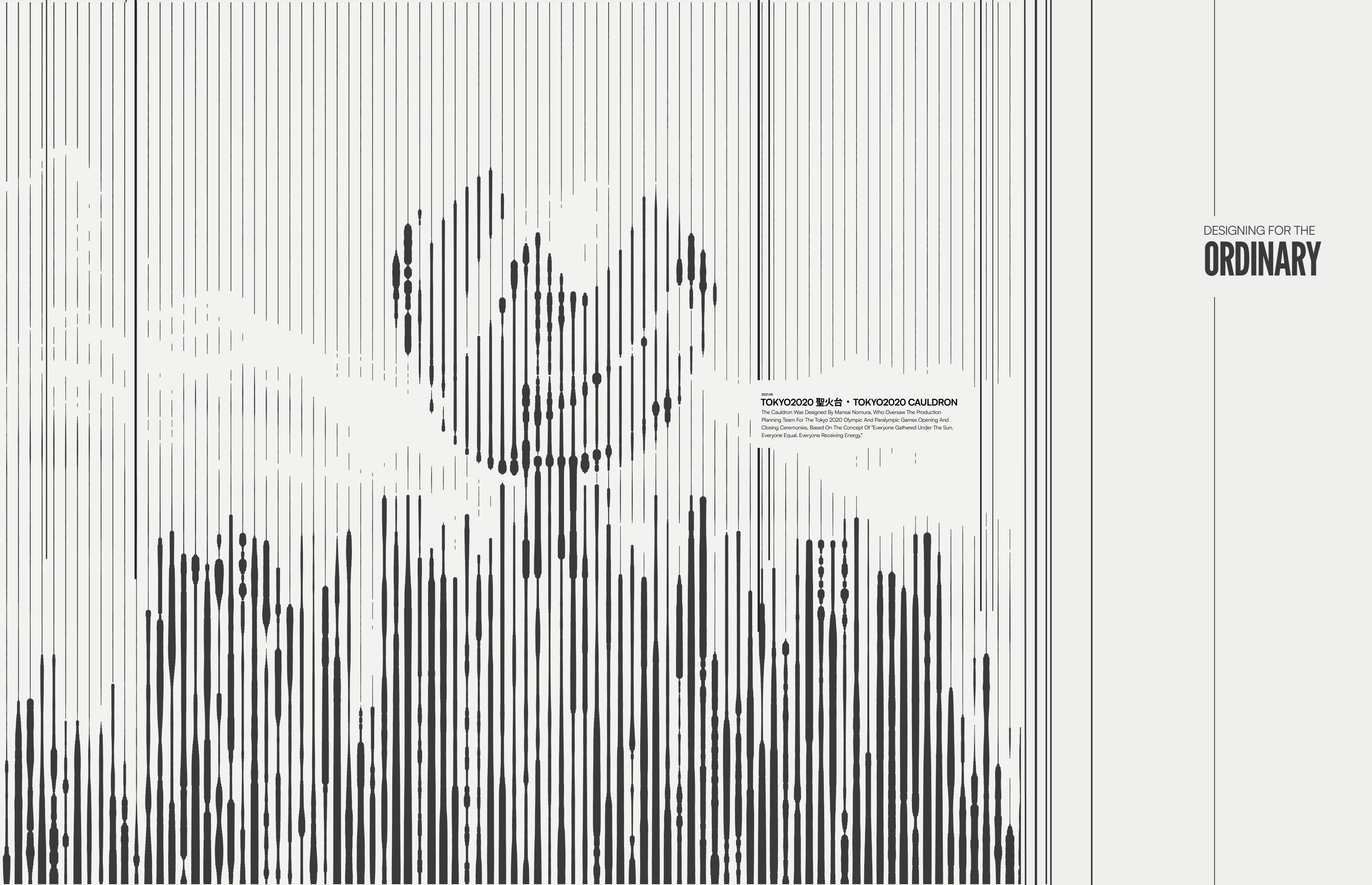
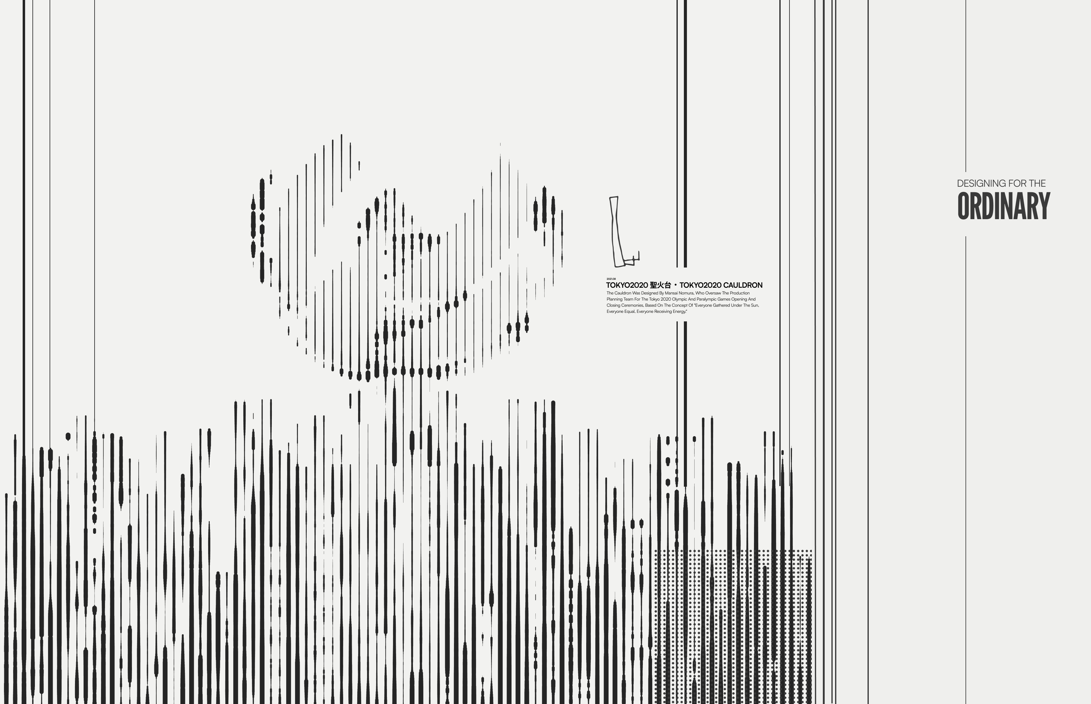
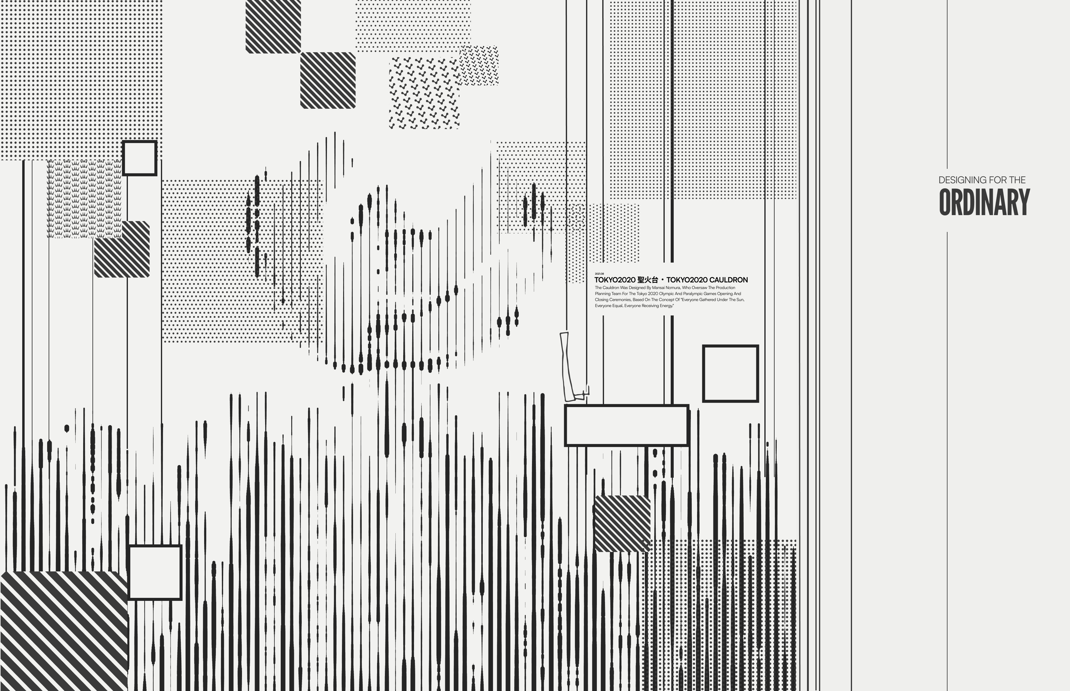
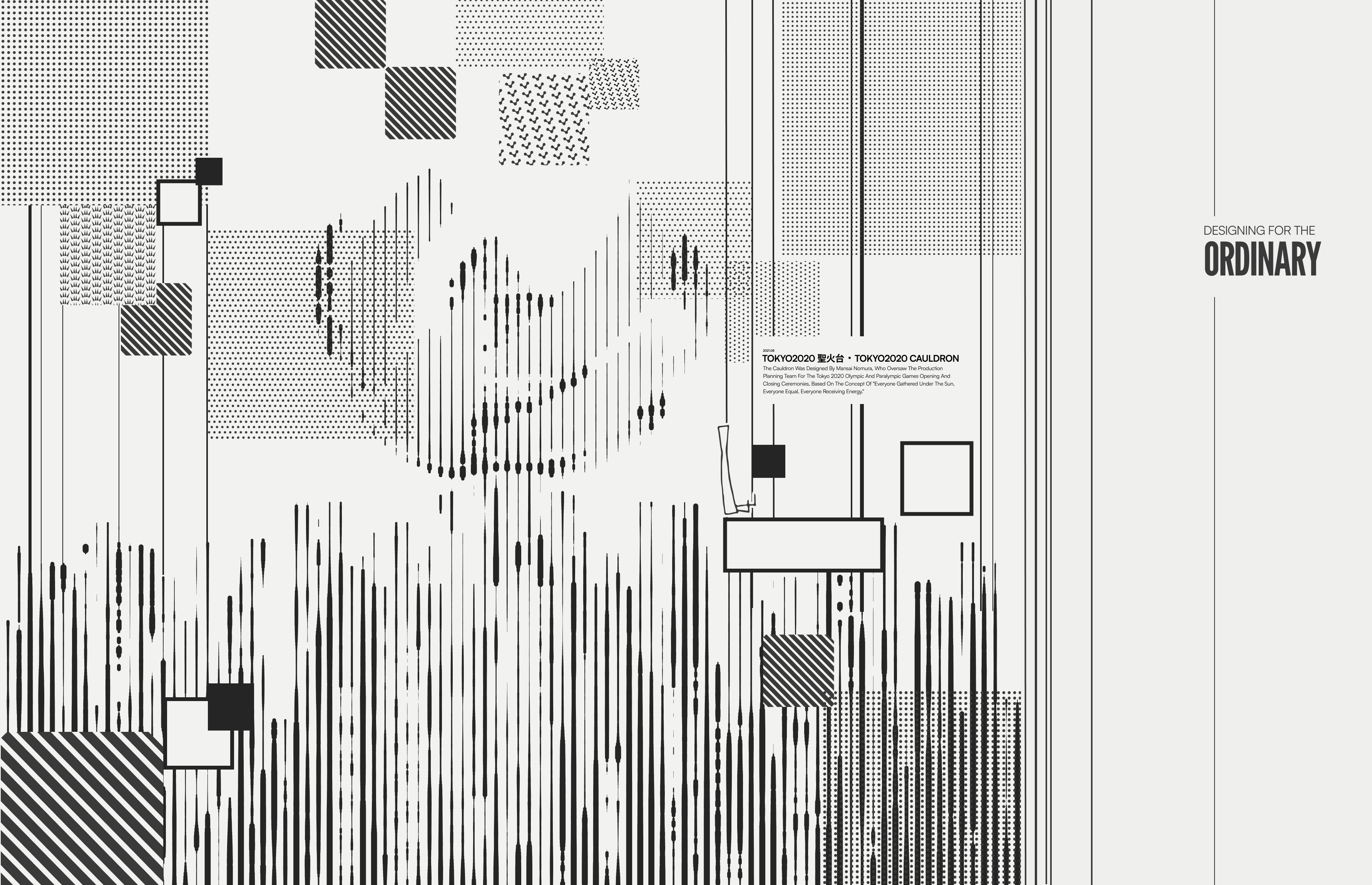
Refining one direction, from a rough sketch to the final isometric poster.
Reflection
What became most meaningful to me throughout the process was recognizing how consistent Oki Sato’s
philosophy is across everything he says and designs. His emphasis on simplicity, warmth, functionality, play, and
“pleasant mistakes” really shaped the way I approached the work. I liked the idea that design does not need
to be loud or overly complex to feel meaningful, and I grew to appreciate the monotone nature of the design system paired
with sparks of colour from his work.
Most importantly, this project reminded me how much design lives in details. Good design is rarely about one huge idea
alone, but about carefully shaping hundreds of subtle decisions that collectively create a feeling.