Reimagining the type specimen
for mobile learning.
Typistry is a mobile-first interactive type specimen platform that
helps designers explore, understand and apply typography through
interaction rather than static reference.
At a glance
Context
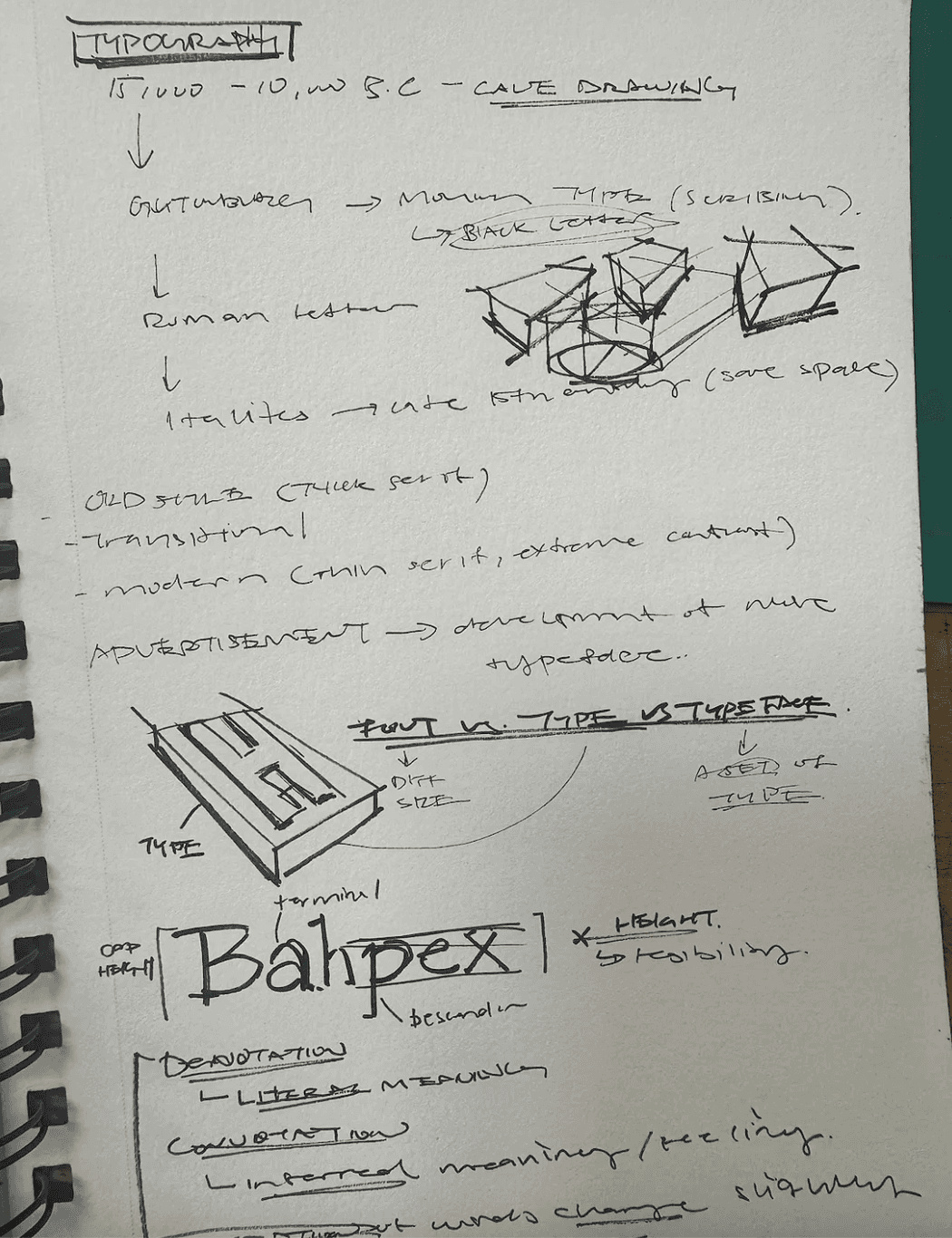
Developed in a Communication Design Studio course, Typistry builds on earlier work in print hierarchy and kinetic
typography. It reframes the specimen book as a learning tool, using interaction, motion and feedback to make typographic concepts
approachable.
As the sole designer, I took the project beyond the assignment: reframing the problem space, growing it into a product vision, and
designing both mobile and web experiences. The work spanned research, UX strategy, visual design, components, accessibility and
high-fidelity prototyping.
Problem
The brief asked for a mobile type specimen app in Figma. Many strong specimen tools already exist on the web, which raised the key question: why design a type specimen for mobile, when fonts aren’t downloaded on phones?
Reframed design prompt
“How might we reimagine the traditional type specimen book as a mobile-first experience that helps users learn, notice and engage with typography through interaction rather than static reference?”
Solution
Redefining the type specimen as a learning tool.
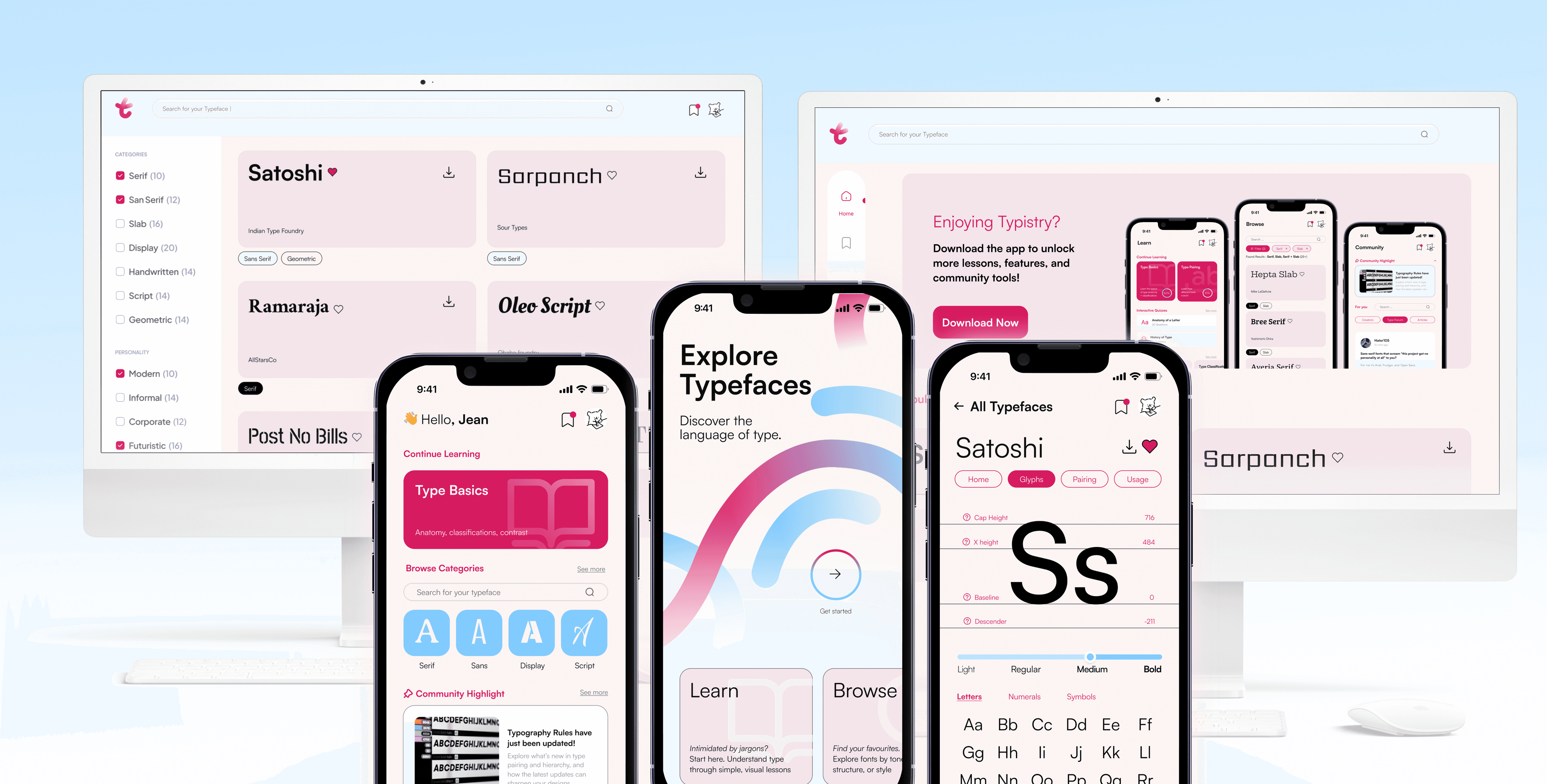
01 Establishing intent
An opening animation and guided introduction that reframes the type specimen as an interactive learning experience, setting expectations through motion and exploration.
02 Integrated learning system
Micro-lessons embedded across the app, guiding users through core typographic concepts with short, readily available explanations.
03 Community-driven knowledge layer
A centralized forum combining expert insights, peer Q&A and curated content to support continuous learning.
04 Structured typeface discovery
Search and filter tools for browsing, refining and saving typefaces.
05 Core type specimen, integrated
The primary focus of the assignment, designed as an interactive specimen and embedded seamlessly within a broader learning system.
06 Desktop as platform extension
A scalable web experience designed for advanced comparison, structured browsing and asset access.
Process
Research, synthesize, visualize, prototype.
- Understanding the brief and constraints
- Reframing: opportunity and hypothesis
- Competitor and market analysis
- Synthesis: pain points and needs
- Wireframes and low-fi sketches
- Information architecture
- User flows and decision points
- Colour, type, iconography, grid
- Moodboards for tone
- Style guide: states and tokens
- Accessibility: contrast, hierarchy, size
- Hi-fi mockups
- Transitions and microinteractions
- Usability testing
- Iteration from testing
01 Research & discovery
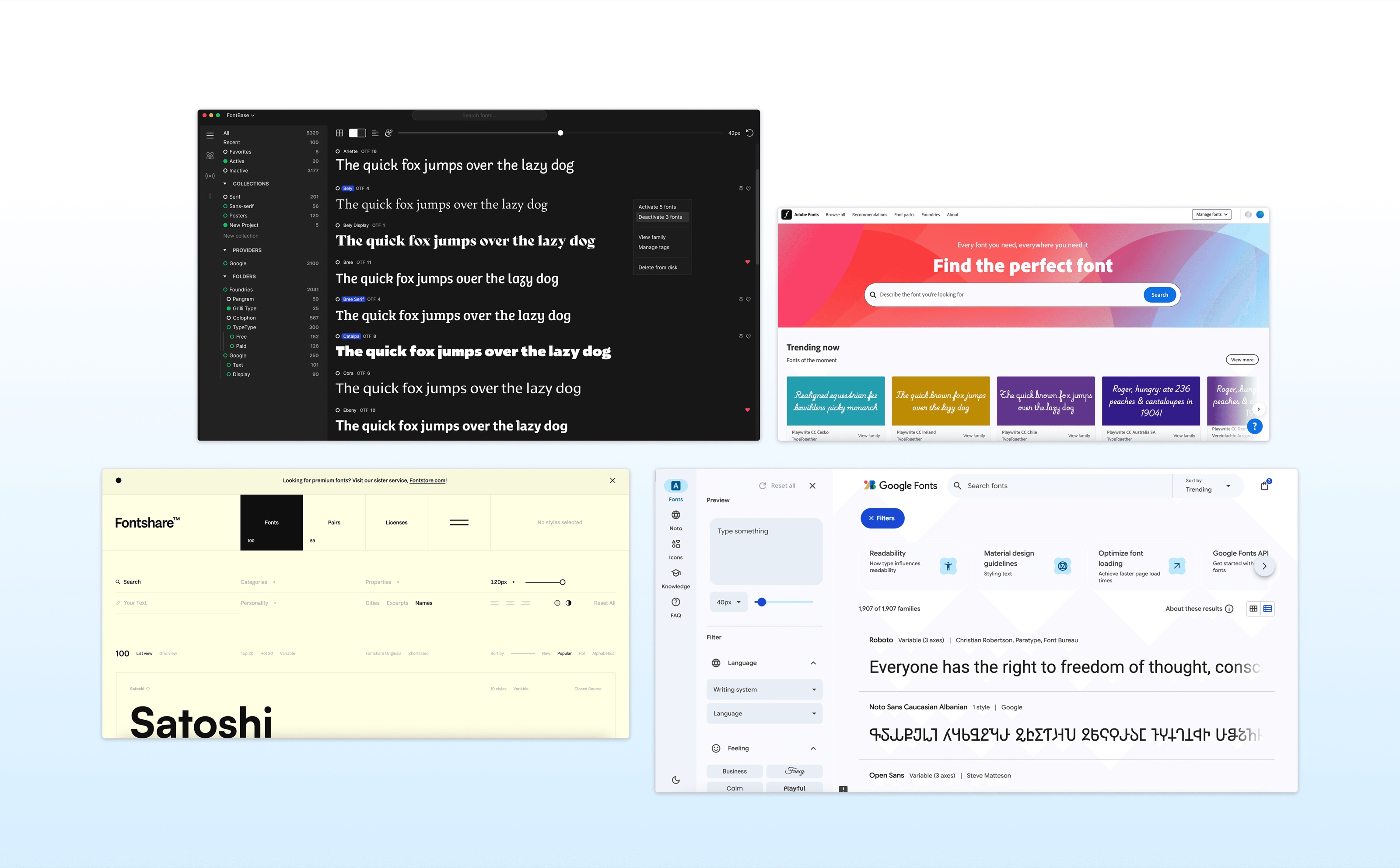
A comparative study of specimen tools, education apps and design resources, like Google Fonts, Font Review Journal and Fontshare. Many excelled at display; few offered interactive learning or community. The gap: passive presentation versus active understanding.
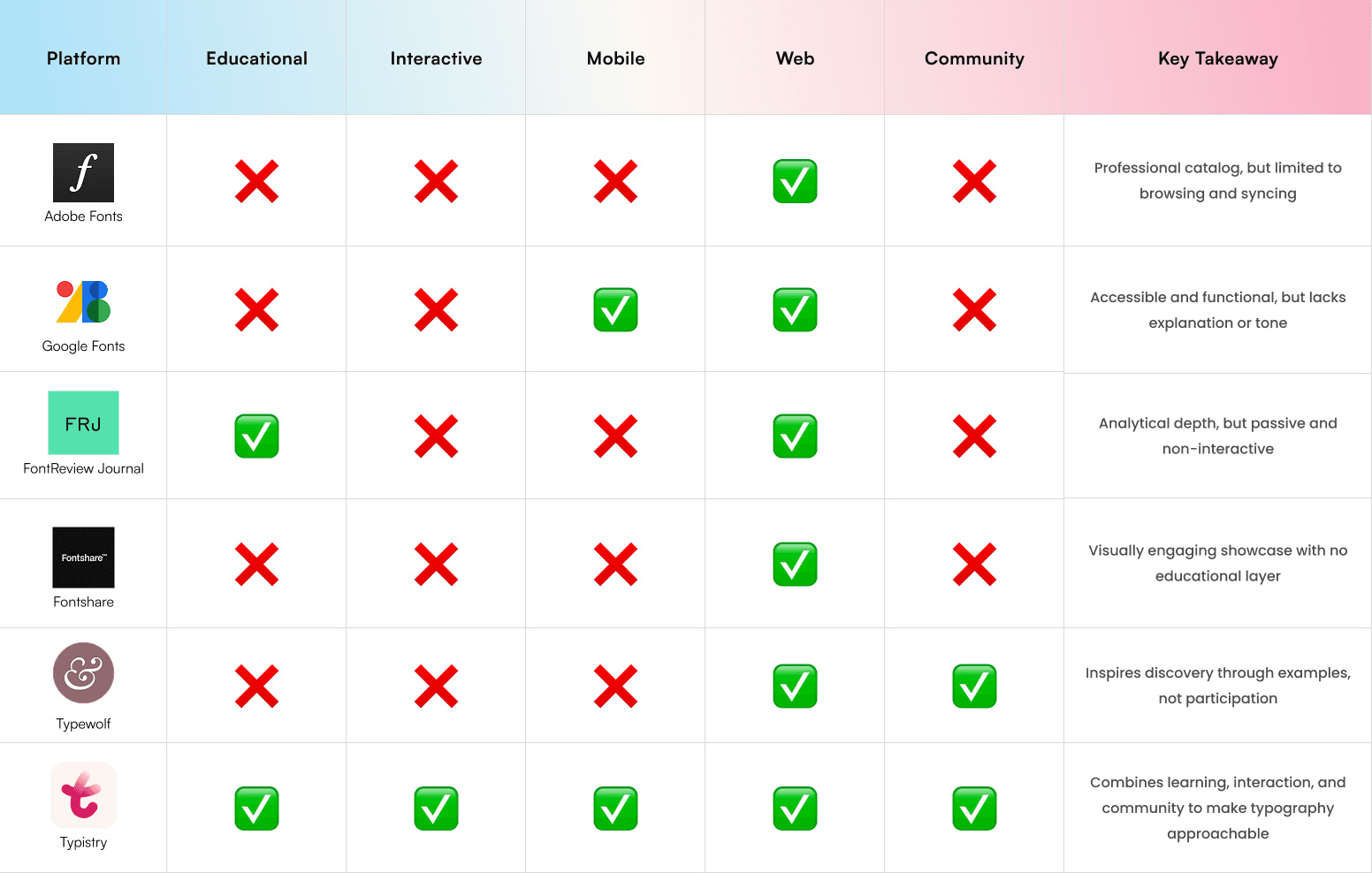
Competitive analysis: plenty of display, little interactive learning.
User personas


Key design insights
02 Ideation
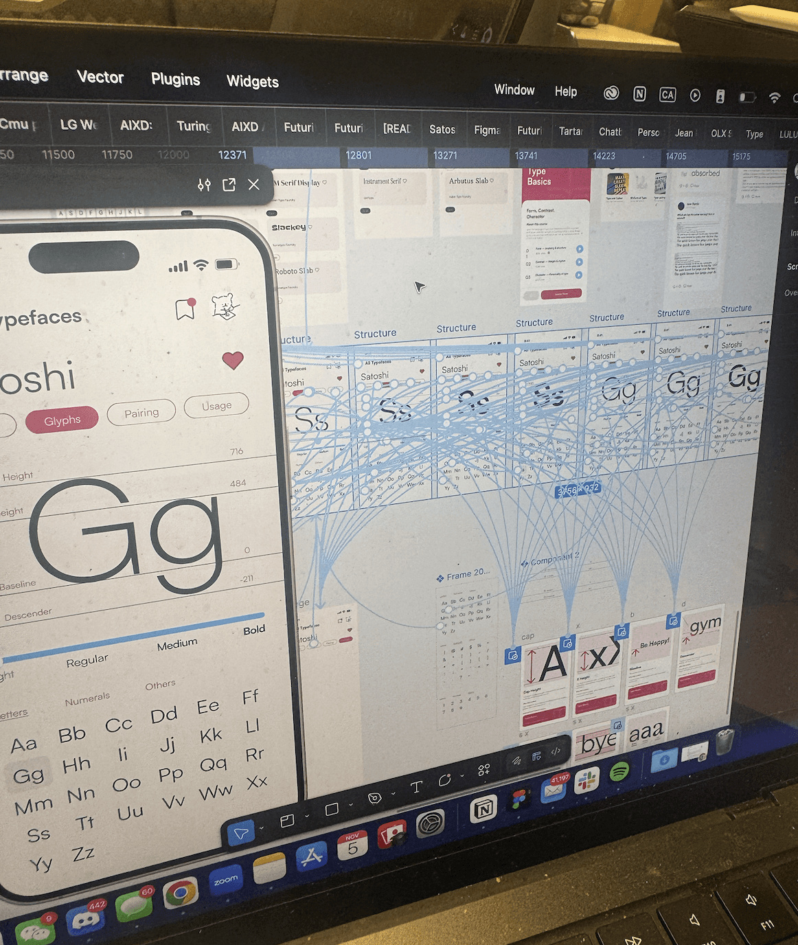
Mapping the system clarified the app’s information hierarchy and the relationships between screens, balancing educational content with typographic exploration. Wireframes then laid out the core screens, flows and type components.
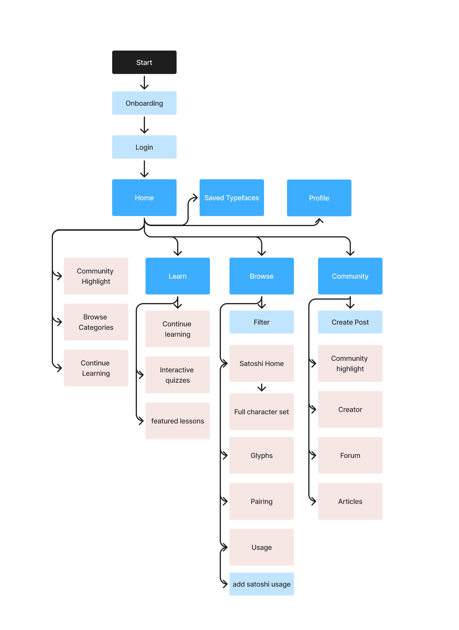
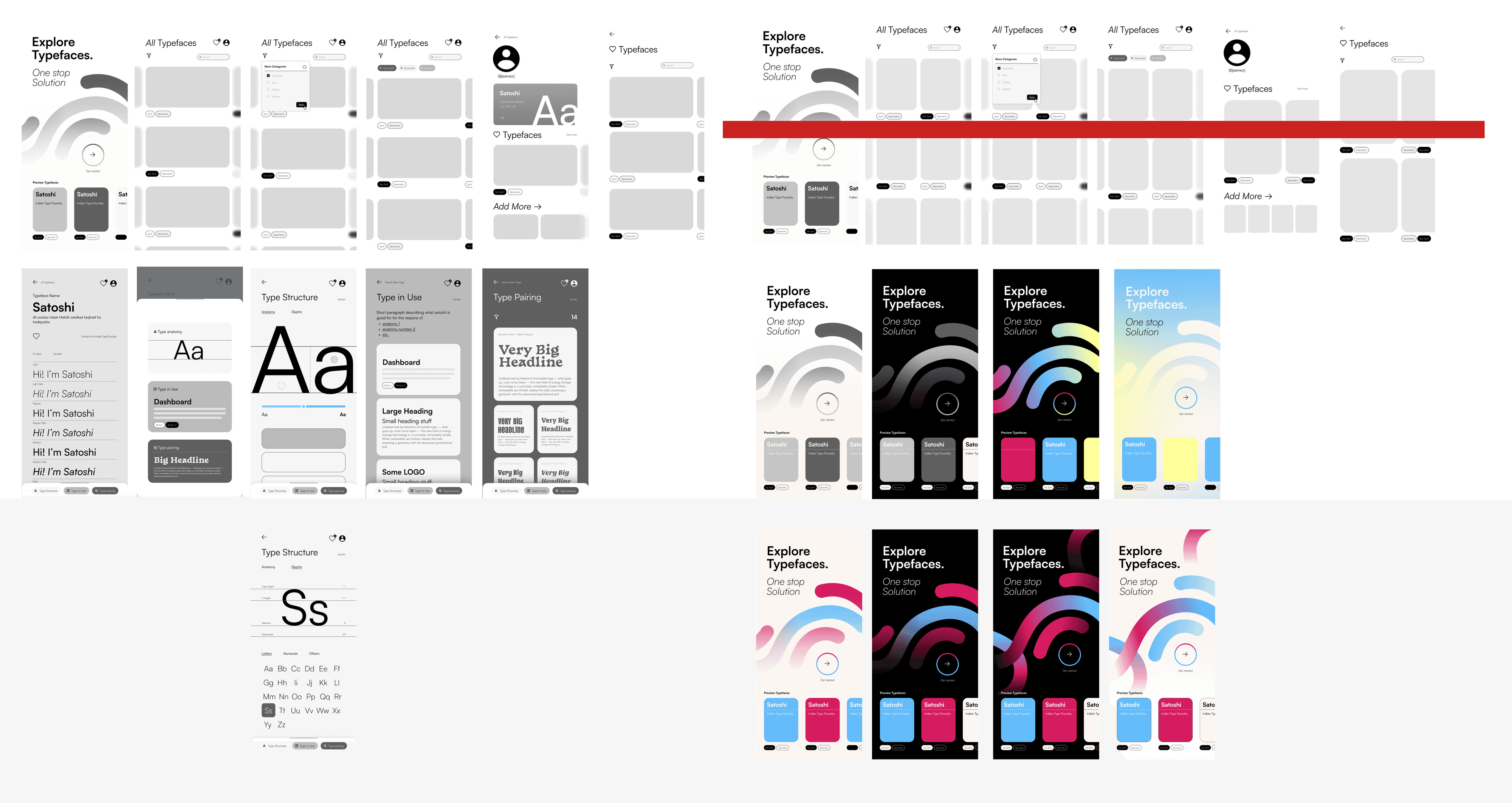
System architecture, then wireframes of the core screens.
03 Visual design & branding
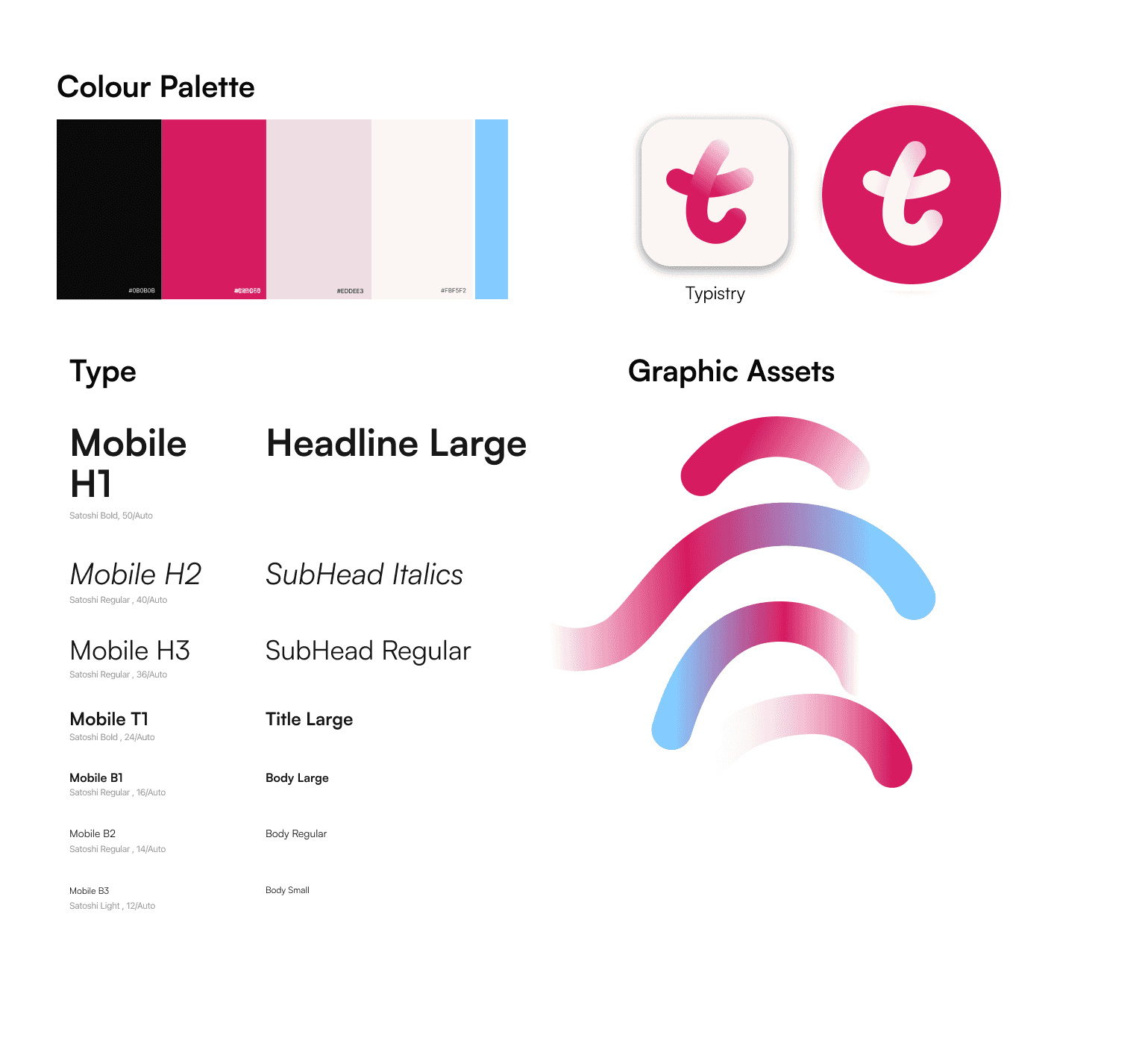
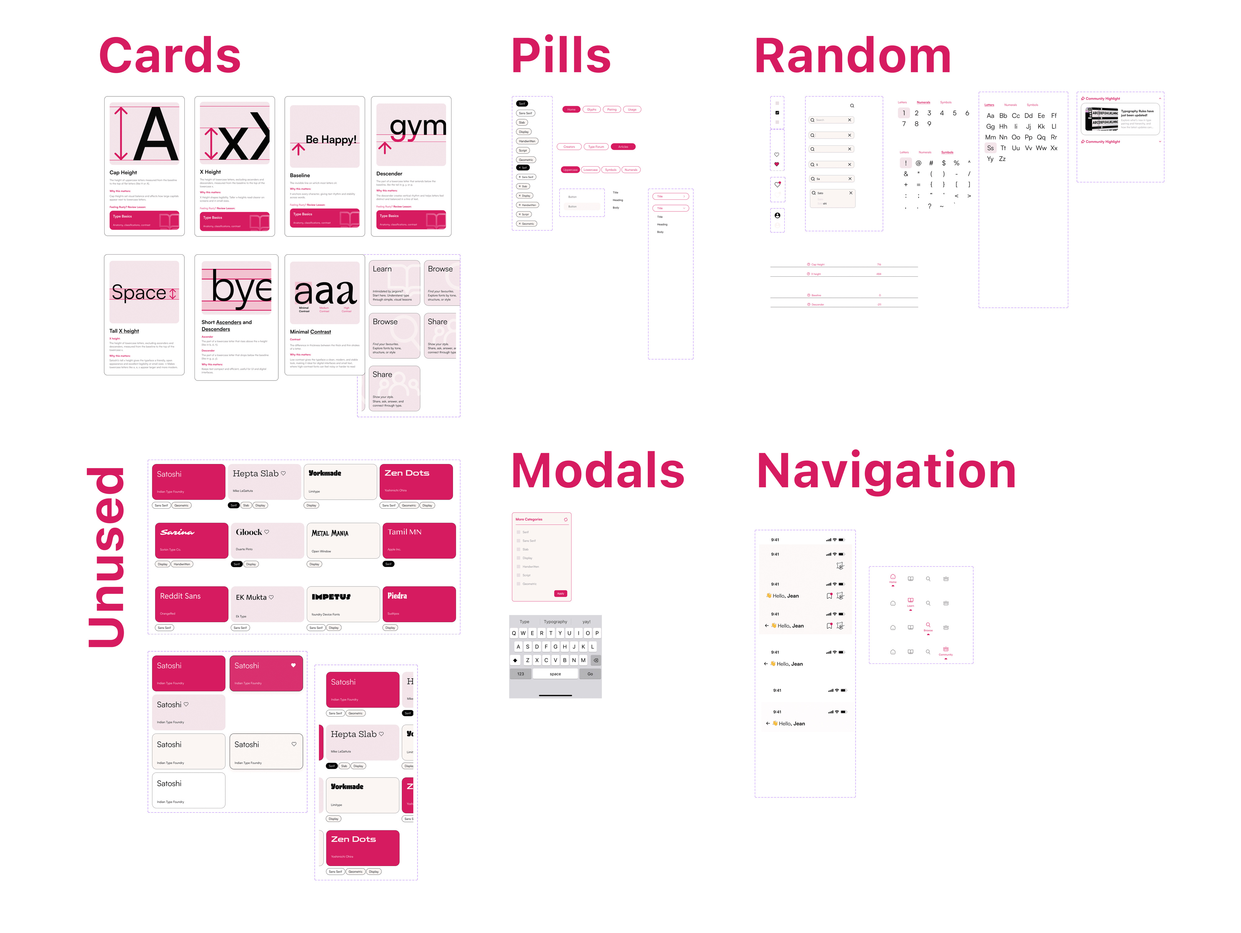
A brand system and component library on a strict grid, checked for AA and AAA contrast.
04 Prototyping & interaction
The first prototype joined every core interaction in one vertical flow: onboarding, lessons, browsing and community, without friction.
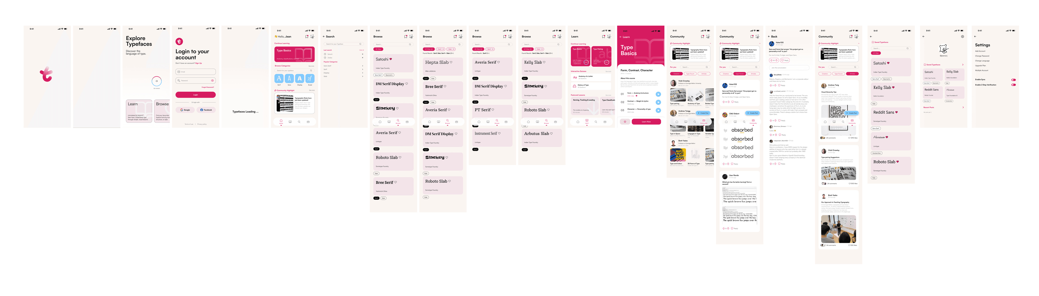
Features flow.
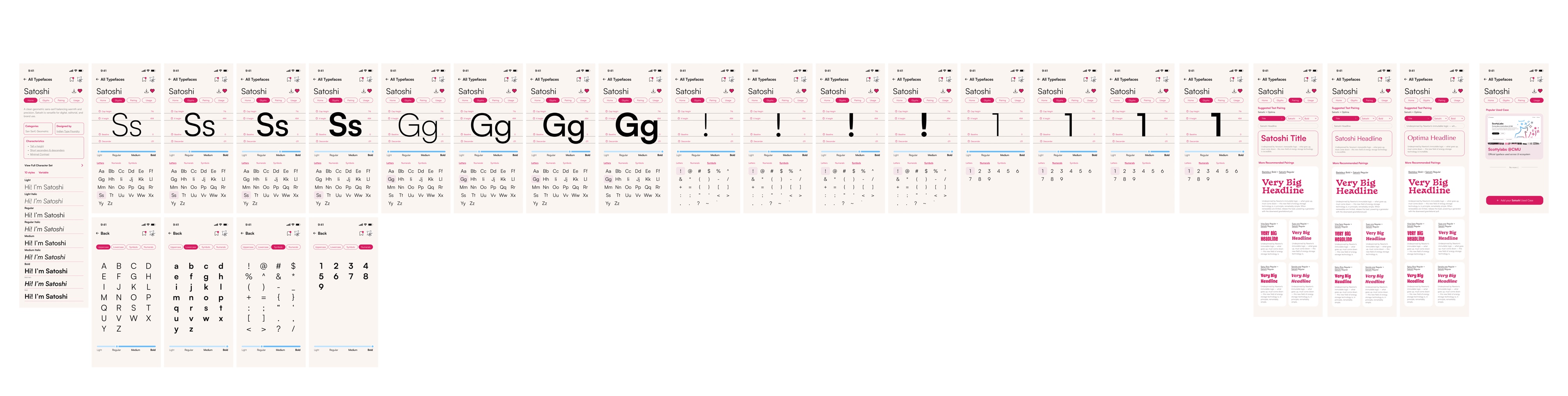
Typeface flow: full character sets, weight comparison and type in use.
Finals
Reflection
As I wrapped up Typistry, I realized how human design really is, because of the questions we ask. From the
start, reframing the brief became the most important part of my process. Instead of building a place to display fonts, I
wanted to design a way for people to learn, notice, and connect with type. That shift only happened because I kept asking
“why.”
The colour palette wasn’t simply about looking nice but about making sure users could focus, read comfortably and feel guided.
AA and AAA contrast checks, hierarchy and type sizing became a way of caring for the people who would use this.
Building the component system taught me to think less about isolated screens and more about systems, and how every change
ripples across an interface: grounded in rules, but open to play.
Bloopers